Design Studio Flora Case    Natura Sacra

From herbal tea to lubricant: building a scalable brand and range architecture across 20+ plant-based SKUs

Natura sacra vegan branding packaging design

Background and challenge

Background

Natura Sacra was launching a new and unconventional plant-based brand, spanning wellness teas, personal care, and intimate products.

From the outset, the range needed to work across highly varied formats and use occasions, while establishing a premium, self-care-led proposition that would translate clearly both on shelf and online.

credits    Design Studio Flora +  Jasmin Schiffer

Challenge

Developing a scalable range architecture that could handle very different product formats, sizes, and use occasions.
Ensuring clear distinction between SKUs and collections
Building a strong, recognisable identity that could carry across packaging, digital, and social media.
Creating a brand world rooted in lifestyle and ritual, not just functional wellness.
Natura Sacra branding, logo designNatura sacra vegan branding design, social media feed postsNatura Sacra vegan branding design colour paletteNatura Sacra vegan branding design colour palettePackaging design: mist and body oil for Natura Sacra

Strategic approach

Strategy - Research

Aligning lifestyle, benefit and format.

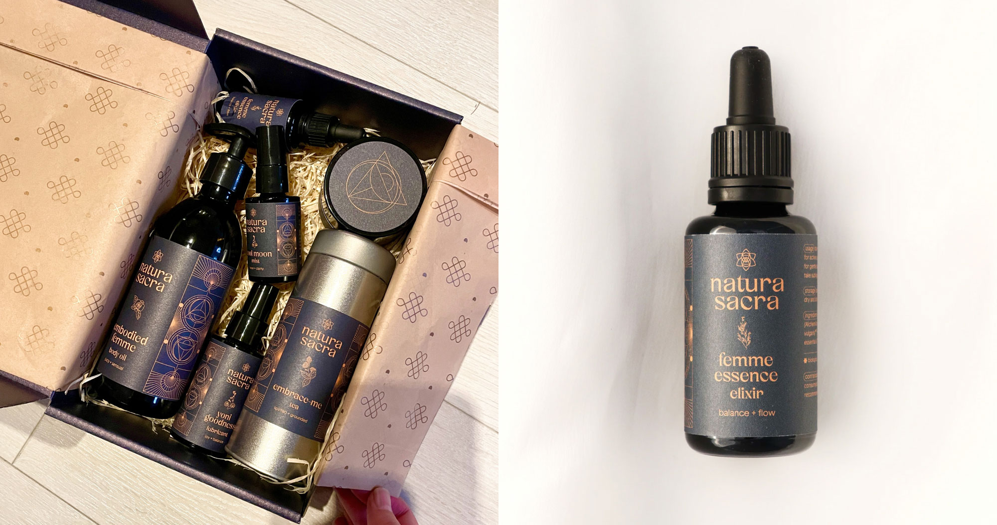
The brand identity and range system was developed from scratch, rooted in a clear positioning: where nature, science, and spirituality meet.

The visual language draws on ancient symbolism, including sacred geometry and references to Celtic and Hindu traditions, creating a distinctive and meaningful brand world.

Branding    Brand Strategy    Packaging Design    Social Media

Implementation

Products were organised into five collections based on use occasion and target consumer.
Clear hierarchy and categorisation were achieved through a structured use of colour, copy, and illustration, allowing each SKU to feel distinct while remaining part of a coherent whole.
The identity was designed with strong lifestyle alignment, reinforcing emotional benefits such as balance, joy, and self-care.
The design system invites consumers to slow down and engage meaningfully with the product experience, rather than rushing past.
Natura Sacra vegan branding design logoNatura Sacra vegan branding design logo
The photography style uncovers the rawness of the natural ingredients, by zooming in on imperfections, veins, roots...
Brand symbolism for Natura Sacra, the circle
Brand symbolism for Natura Sacra, the vesica piscis
Brand symbolism for Natura Sacra, the eye
Brand symbolism for Natura Sacra, triangle
Brand symbolism for Natura Sacra, two triangles
Brand symbolism for Natura Sacra, the triquetra
Brand symbolism for Natura Sacra, flower
Brand symbolism for Natura Sacra, the full logo
previous icon arrow
next arrow icon
Natura Sacra vegan branding design packaging
A system of shapes was developed for photography, masks, & icons, these shapes originate from symbolism of the brand logo
Natura Sacra vegan branding design icon systemNatura Sacra vegan branding design layout

results & outcome

SKUs

A cohesive and recognisable brand identity launched across 20+ SKUs

System

A brand system designed to scale as the range continues to grow

Brand

A highly distinctive brand presence within the wellness category

Consistent positioning executed across packaging, digital,  social media and photography

Clear signposting to quickly distinguish collections, SKUs and product formats

Natura Sacra logo and lubricant packaging designNatura Sacra vegan branding design photographyUnboxing Natura Sacra, packaging designNatura Sacra vegan branding design stickersNatura Sacra vegan branding design patternNatura Sacra vegan branding design photography
Sherif Zaazaa Profile PictureLinkedin icon

Sophie has an impeccable ability to capture the essence of a company's vision and philosophy, and transform that into a brilliant visual identity. The design process was quite seamless. Sophie did an incredible job incubating, researching & maturing the concept, to deliver an eloquently put-together visual identity, one I'm very much proud of. There's a certain harmony working with her; we could easily see eye-to-eye, the work she delivers speaks for itself.

previous icon arrow
next arrow icon
Profile picture of Sophie Shand

Design that looks good isn't always enough

Sophie    Founder Studio Flora

Studio Flora turns strategy into packaging + websites that perform commercially, for FMCG brands that are evolving, launching, or scaling

Enquire now

small arrow icon